
CustomTravelPosters.com
How to infuse wanderlust into seamless shopping, by crafting a more engaging e-commerce experience.
Platform
Responsive Web
Role
Product Designer
UX Writer
Tools
Figma
Photoshop
The business of transforming travel memories into sales isn’t just about making attractive artwork—it requires great UX.
CustomTravelPosters.com had tapped into a powerful emotional insight: people want to revisit meaningful travel memories after they return home from their trip. Yet, despite having a compelling product idea, the site’s 1.1% conversion rate was significantly lower than the 1.7% industry benchmark for its business category¹.
The Problem
CustomTravelPosters.com had a product visitors liked in concept, but users felt underwhelmed and uncertain about the product’s value due to unclear messaging and uninspiring visuals—resulting in low engagement, missed conversions, and abandoned visits.
To strategically reposition CustomTravelPosters.com, I began by conducting a thorough competitive analysis of over a dozen leading e-commerce sites specializing in prints, posters, and home decor.
My goal was to identify UX best practices, combine them with user insights, and surface opportunities tailored to their product.
Through careful analysis of competitor sites, I identified key patterns and benchmarks around visual impact, emotional storytelling, trust signals, and frictionless purchasing experiences.


The Objective
Based on these insights, I defined three UX objectives to guide the redesign:
Establish Emotional Engagement & Trust
Instantly capture users with emotionally compelling visual storytelling and nostalgia, while establishing trust through clear messaging, customer reviews, and high-quality visuals.
Provide a Frictionless User Journey
Guide visitors seamlessly from initial curiosity through intuitive exploration, effortless customization, and a streamlined checkout process—minimizing cognitive load and reducing decision fatigue.
Deliver a Responsive & Cohesive Brand Experience
Create a stunning, cohesive brand experience with consistent, delightful interactions across all devices, supported by persuasive sales copy and clear CTAs to boost conversions.
What Users Revealed About The Current Experience
Building on insights uncovered during competitive benchmarking, I conducted five user interviews to validate assumptions, uncover usability gaps, and identify emotional friction points within the experience.
By pairing industry best practices with real user behavior, I was able to move from abstract hypotheses to actionable design opportunities grounded in actual customer needs.
Current Site Audit: Friction Points & Missed Opportunities


Turning User Research Into Strategic Insights
To better understand where potential customers were dropping off, I mapped the current user experience to the classic AIDA framework, which tracks how customers move from Awareness → Interest → Desire → Action on their path to purchase.
The resulting user journey map transformed qualitative feedback into an actionable framework clearly showing where users were prematurely exiting the funnel and revealing high-impact opportunities to reduce friction, spark interest, and help users feel confident and excited about creating their own custom travel poster.
Current User Journey: From Awareness to Purchase

This user journey visualizes how each stage of the AIDA sales funnel introduces emotional friction that stalls momentum. Highlighted opportunities reveal where strategic UX and visual design can create interest, inspire confidence, and move visitors from interest to purchase.
With strategic insights in hand, I translated the opportunities previously identified into a visually impactful, emotionally engaging redesign of CustomTravelPosters.com.
The new high-fidelity wireframes aimed to instantly resonate with first-time visitors, making the journey from curiosity to confident purchase seamless and compelling.
Bringing the Brand to Life: A Visually-Driven User Journey That Captures Attention and Inspires Action


(1) New logo is more consistent with the brand’s personality and easier to read. (2) Bold, immersive hero image draws users in sparking curiosity. (3) Visual hierarchy reinforces brand messaging and (4) guides users to the CTA. (5) Motion keeps users engaged while showcasing the product. (6) Value proposition invites users to relive their favorite travel moments and imagine them as art.


(7) Broadened the product assortment and introduced new art styles, increasing product appeal and helping more users find a style they like.


(8) Images with people draw the eye faster, hold attention longer, and deepen emotional engagement. (9) A neutral palette and clear visual hierarchy keep the focus on the product while ensuring important information is easy to find. (10) Textures like wood grain add visual warmth and depth to product imagery. (11) A curated, modern setting elevates the product, making it feel more aspirational and design-forward.


(12) Breadcrumb navigation gives users a clear sense of place and an easy path back to previous pages. (13) Key benefits placed above product options build trust and reduce purchase hesitation. (14) Adding visual representations of product options makes browsing faster, easier, and more engaging for users.
To position CustomTravelPosters.com as a design-forward, high-quality brand, I created a bold yet minimalist visual identity—as seen in the previous section.
Visual Direction & Brand Keywords

Primary Typefaces

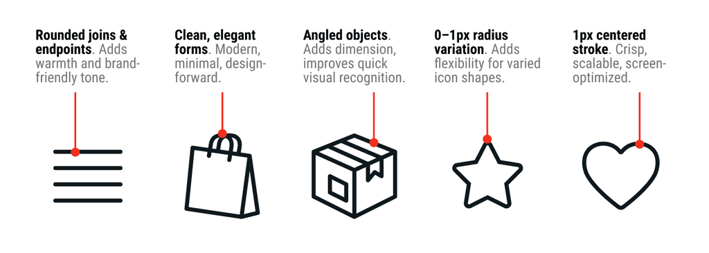
Iconography Guidelines
Logo Redesign

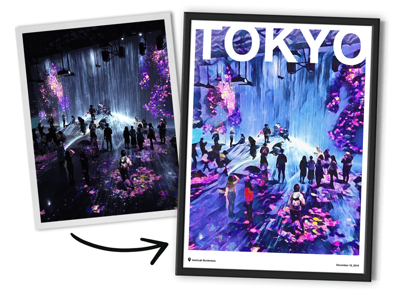
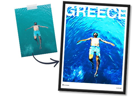
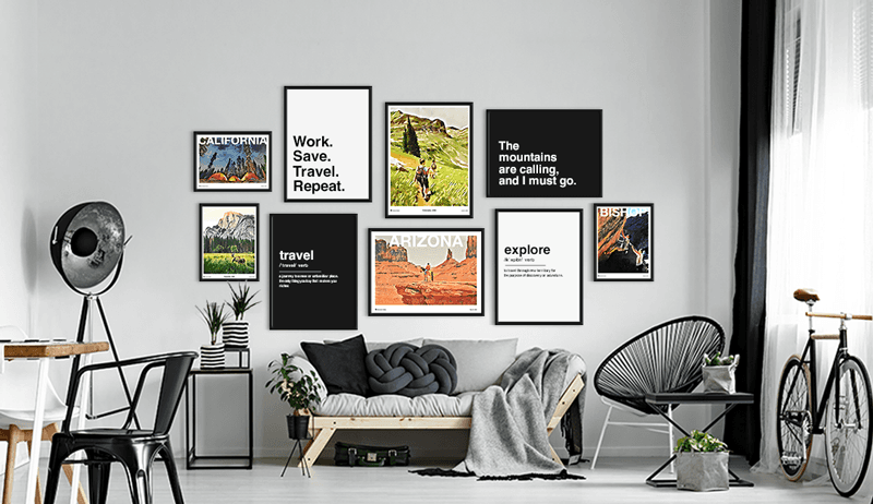
Visual Inspiration for Site Imagery Direction

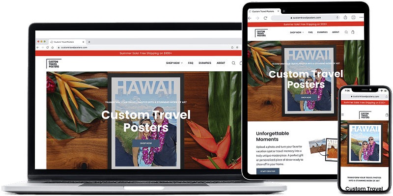
Responsive Breakpoints
To deliver visual consistency, reinforce brand credibility, and ensure an intuitive user experience, I adapted the site's high-fidelity mobile designs to responsive breakpoints for tablet and desktop—providing every visitor with a frictionless journey, regardless of device.
The Impact of Data-Driven Design
By turning real user insights into focused, high-impact UX solutions, I set out to redesign CustomTravelPosters.com as a brand-forward, mobile-first shopping experience. Post launch, I’d measure success using the following KPIs, with clear targets aligned to business goals:
Conversion Rate: Increase from a 1.1% baseline to 1.7% or higher, aligning with the industry benchmark for DTC e-commerce¹.
Bounce Rate: Reduce early exits across devices, with a focus on desktop—where usability issues were evident during testing..
Checkout Abandonment Rate: Track where users exit the purchase flow and reduce friction at each step.
Final Thoughts
This project was more than a visual refresh—it was a strategic redesign grounded in user insights, product thinking, and brand storytelling. By identifying key drop-off points and emotional friction in the user journey, I crafted a high-fidelity experience designed to build trust, communicate value, and guide users seamlessly from curiosity to conversion.
Whether it's redesigning a homepage hero to spark excitement, evolving a brand system to signal quality, or reworking a purchase flow to remove decision fatigue, I bring a product-focused mindset to every design challenge—ensuring my solutions are not only visually engaging, but grounded in strategy and built to perform.
¹ DoDropshipping, "Print on Demand Statistics: 2023 Trends and Insights," DoDropshipping, 2023, https://dodropshipping.com/print-on-demand-statistics/.